Light and Optics Prototyping with Phaeno: Part 2
Over the last couple months I’ve been putting together new exhibit prototypes on the theme of light and optics to contribute to a big renovation effort in the works at Phaeno Science Center in Wolfsburg, Germany. Last week I had the chance to spend time with the team there, test out some of the “half-baked ideas” with museum visitors and brainstorm the next steps in the process.
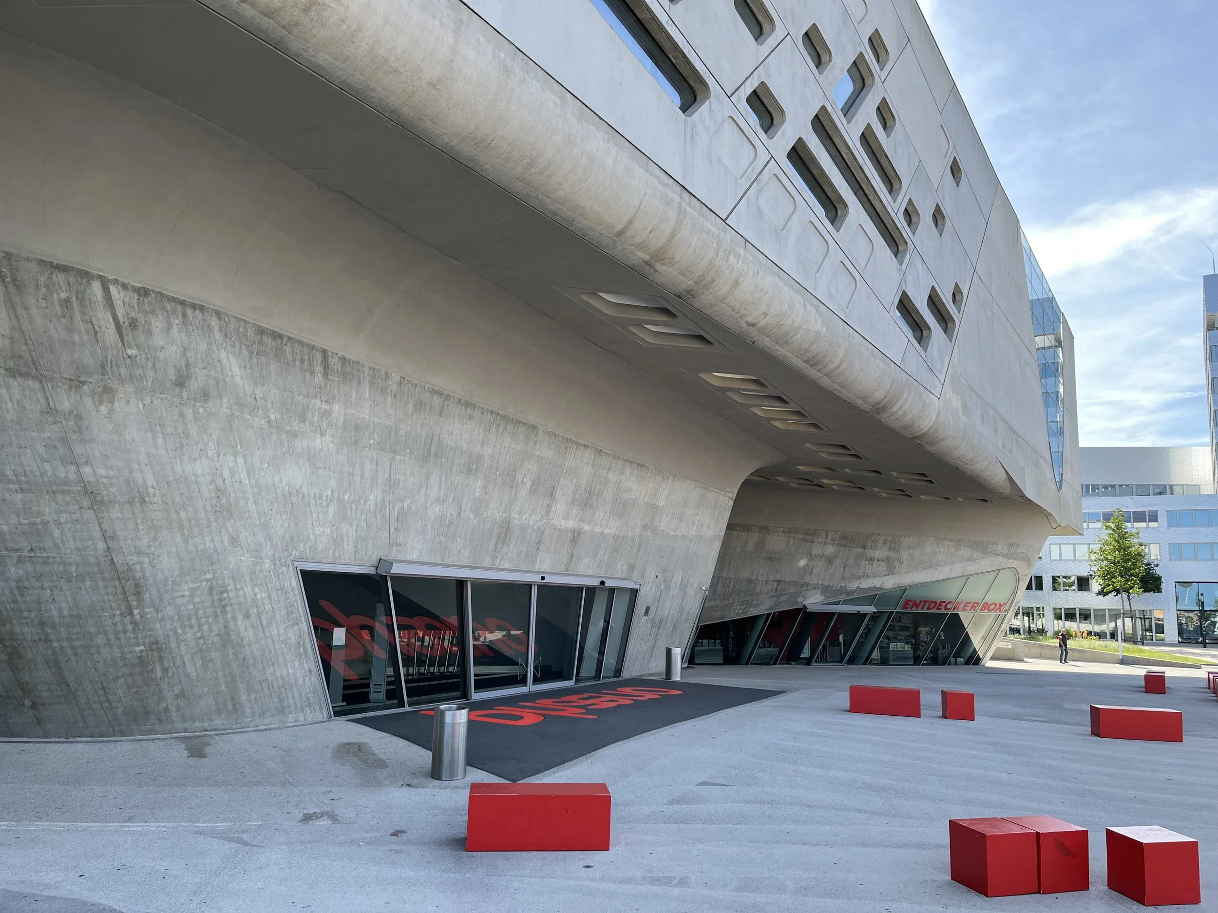
I really appreciated the environment at Phaeno which actually reminded me a bit of the feeling of the ‘old’ Exploratorium at the Palace of Fine Arts. The science center uses a dramatic Zahra Hadid building as the backdrop for a huge collection of phenomenon based experiments. I appreciated how there were so many different exhibits exploring each single theme like kaleidoscopes or ball runs. There were many artist works sprinkled throughout the center by classic science center contributors like Arthur Ganson, Paul Spooner and Mary Ziegler.
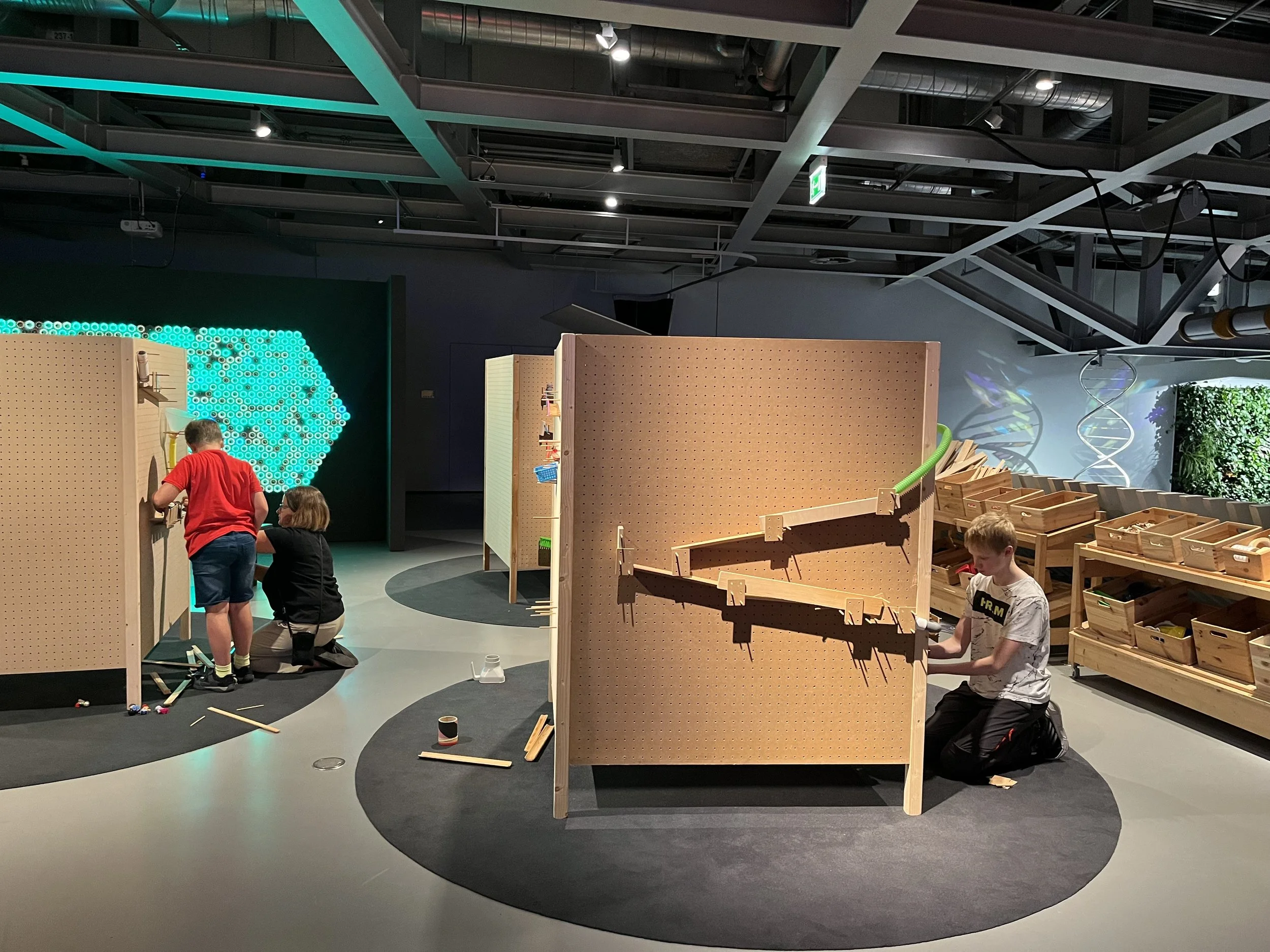
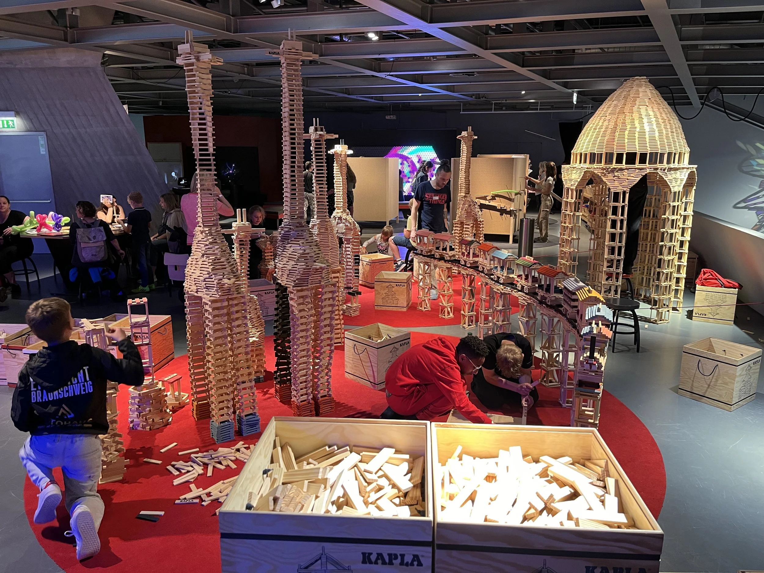
We spent four days on the museum floor testing our experiments in a corner of the center that also featured a inspiring facilitated kapla blocks installation and a new “tinkering studio style” marble machine zone with collaborative building surfaces. I feel that being surrounded by more learner-centric experiences with loose parts and open-ended goals helped visitors enter our “prototyping” area with a open mind to play and test new ideas.
The overall goals for the project can be defined as making the exhibits in the light and optics section a bit more tinkerable. This can mean a lot of things, but some of the ideas that we’re trying to add into the prototypes are increasing possiblities for collaboration, building in more connections to the everyday world, giving visitors more agency to make their own decisions, adding in art and letting play be a fruitful entry point to the materials investigations.
The first experiment we tried was based on the light island exhibit and inspired by artists who use mirrors and filters to cast beautiful shadow patterns. There were movable magnetic light bases, mirrors with colored gels and some everyday objects like small disco balls and water bottles that made interesting effects for the beam of light. We were interested to see how having all of the parts be adjustable and a more narrow materials set focusing on colored pathways might effect visitor interaction.
Some of the things that we observed is that people tended to create their own little exploration space with a light source, mirrors and a disco ball in the center. This might encourage us to think about how the materials or environments could support the creation of mini working zones. As well we noticed that the most interesting effects happened when there was a little bit of motion added to the scenes. To help with this we hung a disco ball on a slow moving motor in the center of the back wall opening up possibilities for casting light on that spinning surface. We might consider adding more moving platforms in a final exhibit design.
Another interesting group of materials that we added to the set during the time together were dichroic fliters which are a material reflect and transmit different colors of light. These created surprising and unexpected patterns and allowed for more customization of the light landscape.
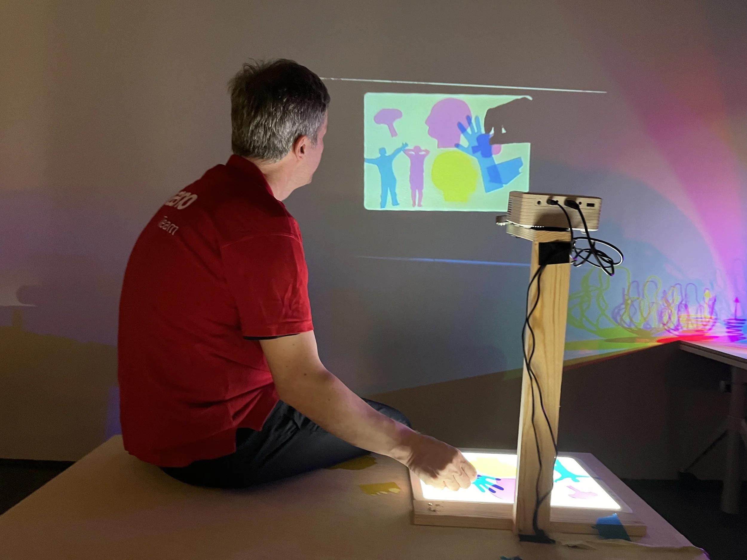
The next exploration space that we tried focused on subtractive color mixing and storytelling. We made two stations where visitors could mess around with cyan, magenta and yellow shapes to create interesting scenes that played with the overlapping characters.
The first station was based around two light tables where visitors could lay the filters flat and construct a scene on the illuminated surface. One of the things that I wanted to try was adding a camera and a projector so that one of the workspaces was reflected on the wall. Using a raspberry pi made this relatively easy. We noticed how this for one made the station more visible and engaging but also that we had to be careful that it wasn’t distracting for the person working. For the next time I definitely wouldn’t have it over the shoulder of the visitor sitting at the station.
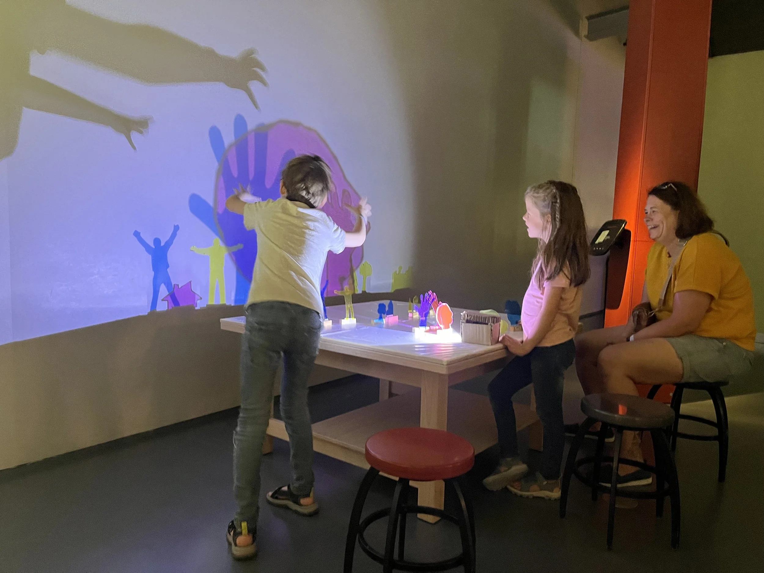
The second iteration of the subtractive color mixing used the same transparent shapes but made a white light cast the shadows of the objects on a large wall next to the station. This also let visitors play with size and scale which added to the possibilities for telling stories with the mix of people, body parts, houses and trees that we used as our first tester set.
I think out of the two versions, we’re more interested to continue with the wall projection station. While similarly to the projected light table, it attracts other visitors to the space, the nature of the interaction felt more collaborative. There were groups that worked in a similar way to how I’ve seen people interact with the stop motion animation station where someone would take on the role of the director, another the mover of parts and someone else playing the part of the writer of the story.
Some of the interesting things that we noticed during testing were how some parts became more interesting and funny when changing the scale came into play. Especially the profiles, hand and full bodies offers tons of possible directions for wordless narratives. Changing the position of the same group of objects could change a scene from giants playing with a tiny human to someone sinking in quicksand, with many other possibilities in-between. I’d like to find more characters or objects that are beautiful or compelling on their own as abstract shapes but also can be added to stories. And thinking about the phenomenon of color mixing, one interesting moment was when a group who hadn’t been paying much attention to the overlapping colors noticed that a yellow tree on a blue background turned green. One of the siblings shouted, “now the tree is green!” which led them to more explorations of the color mixing theme. This organic and unexpected moment made us think that having either shapes that make sense to overlap (like hands giving high fives) or shapes that are “supposed” to be red green or blue could be interesting things to explore.
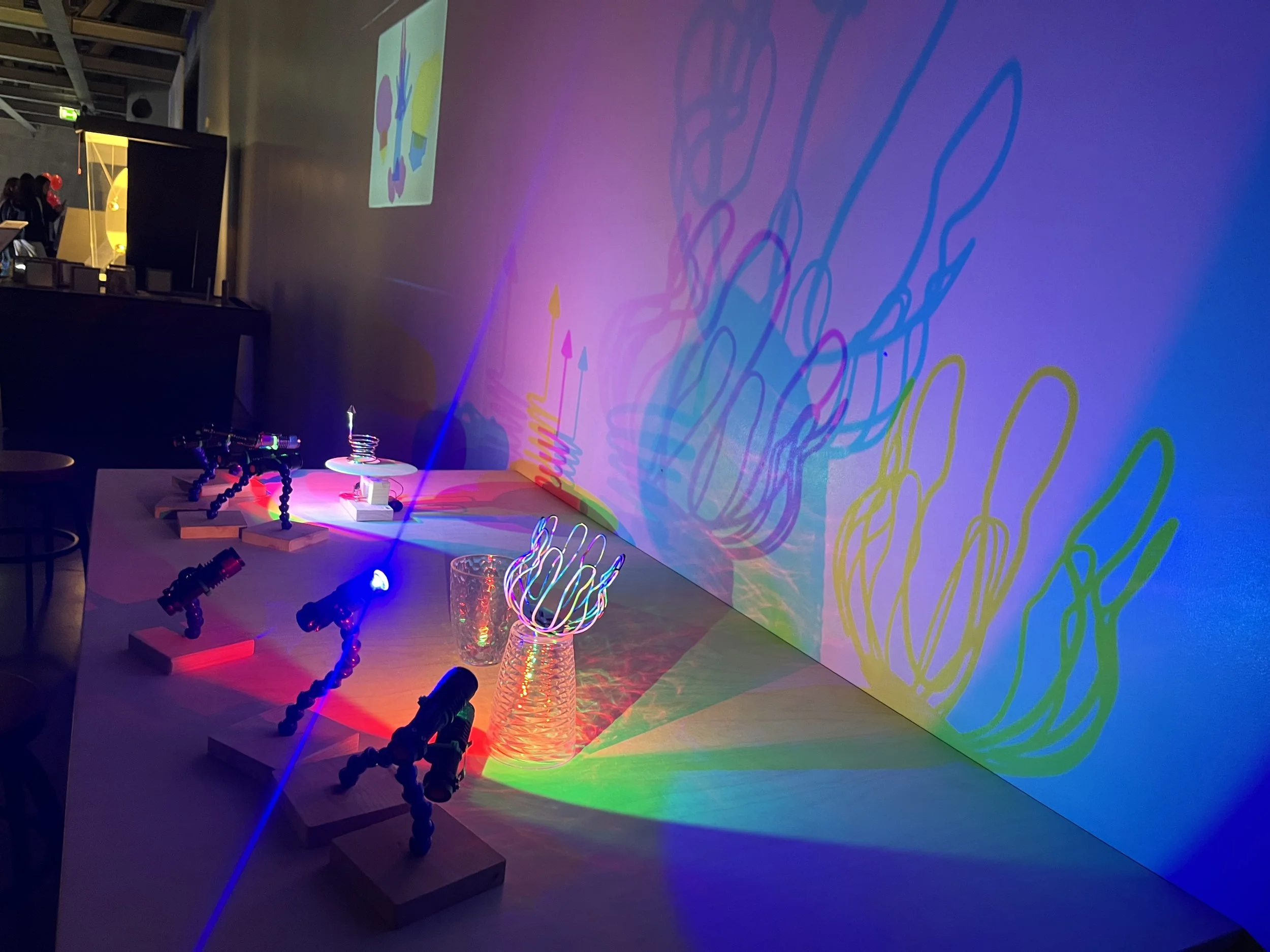
Our third exhibit prototype was a take-off of the classic full body colored shadows experience but as a tinkering station with slow moving motors, adjustable lights and a bunch of everyday materials like strainers, reading glasses and even cardboard cup holders. Visitors could cast shadows with just one red, green and blue light or add a few more to make an Oafur Eliasson style uncertain shadow scene. The patterns projected on the wall were absolutely beautiful with the addition of motion and it was cool to see how people used this station either before or after engaging with the traditional exhibit.
One of the interesting things that we noticed about this station was the ways that the colored shadows passed through or were projected on the internal surface of the objects. Some of the things that we picked out at the local “dollar store” like strainers or a small basket with little holes in it made really beautiful shadow patterns inside the shapes. It would be interesting to play more with this effect and see which size and shape of holes make for the most compelling examples. A question that we have based on this exhibit is how much freedom to give the person engaging with the station. Sometimes it might be helpful to limit the motion of the lamps or the position of the motors for example to lower the threshold for engagement.
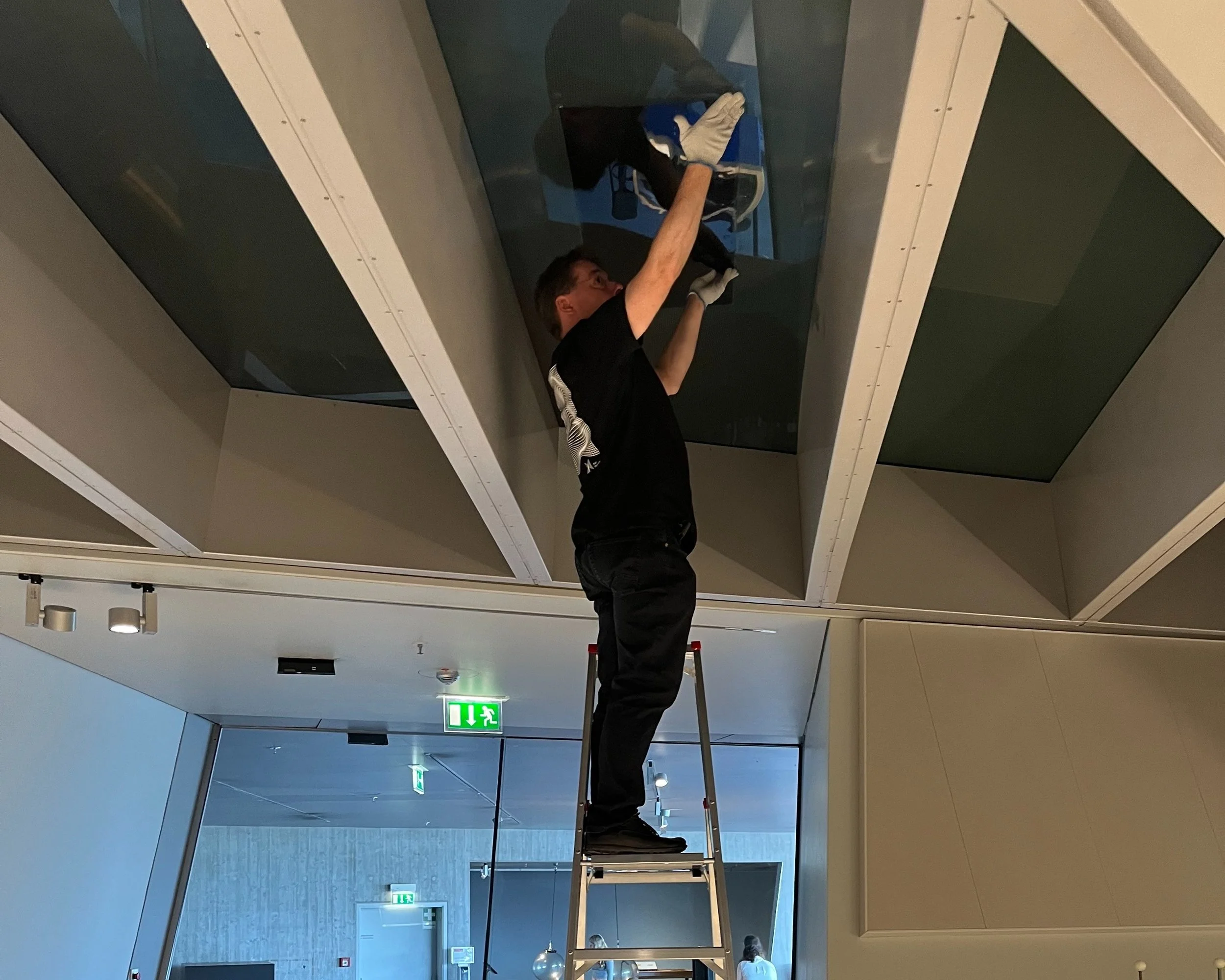
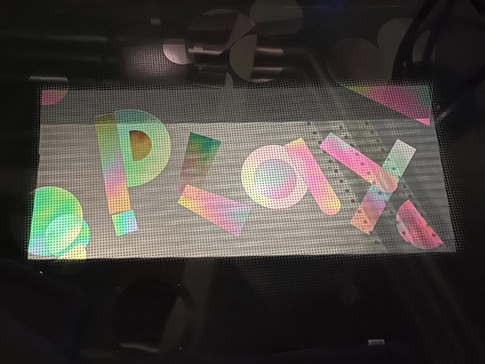
One more fun environmental exploration that we tried for the light and optics environment used the glass floor that connects the upper exhibit gallery to the downstairs tech lab. We added a polarizing filter to the bottom of the glass window and then added clear shapes and circular viewers to the floor above the workshop. This experiment seems interesting as a way to allow visitors to make an unexpected discovery, connect two parts of the museum and to engage in a more calm or relaxed way with phenomenon.
The main thing that we’re trying to understand here is how to make this space both comfortable for exploration but also a subtle area to discover. We experimented with adding cushions to the floor to make more of a lounge type environment as well as thought about how to place the polarization space to be semi-protected in the flow of visitor traffic.
It was cool to see the different ways that people used this exhibit ptototype and it was very common that one of a group would discover it and then bring over the rest of their companions. We’re looking forward to testing different ways to prompt deeper engagement with polarization. We imagined that visitors might be able to write secret messages, decorate already places shapes or create a tiled floor pattern.
The last exhibit prototype that we’re focusing on builds on the idea of the optics workbench which is a collection of lenses, screens, slides and pinholes that all are lined up with each other. With this set up there are many different ways to explore the effects of the different materials on the system. However there are a few challenges with the exhibit that we would like to work on during the prototyping phase of the project. We have observed that visitors sometimes don’t know where to begin so we’d like to limit to exploration space so just a few different parts that can be arranged in many different ways.
Another thing that we are thinking about is how to make the experience more focused on the beautiful and art-inspired possibilities of playing with light. To that effect, one of the changes that we experimented with is an lens array which created multiple images out of a single light source. Just with a couple other elements it was possible to make beautiful abstract patterns and tweak the more concrete slide images. We didn’t have too much time to prototype this idea but one of the things that we’d like to explore more are other materials that push on the boundaries of art using this more traditional scientific instrument.
The week at Phaeno provided so many new ideas and inputs for our prototyping process. It once again reinforced the importance of having concrete examples to look at and discuss as we refine the ideas. And through testing with visitors on the floor of the museum we can observe the best ways to imbue tinkering qualities into the prototypes. Looking forward to the next steps in the process as we further develop these exhibit ideas.
