Ufte Reflections and Big Ideas - Part One
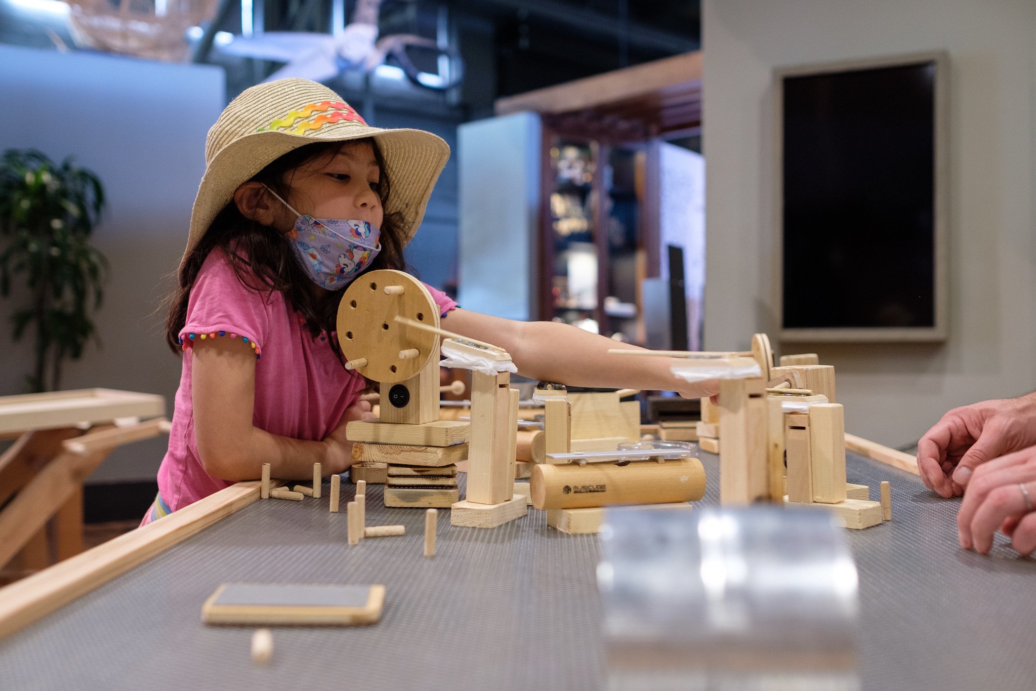
Over the past six month, the Tinkering Studio and Wonderful Idea Company have been on a design sprint to develop four new “ufte” activities for the Exploratorium and a network of museums interested in playful learning. The projects that we’ve been working on are centered around kinetic balancing sculptures, rhythm mechanism blocks, digital shadow remix and unusual rollers.
We define ‘uftes’ as unfacilitated tinkerable experiences which don’t require a constant staff presence to function on a museum floor for an extended period. They provide an intuitive starting point for people to become engaged, have a robust set of re-usable parts and allow for learners to demonstrate agency and ownership.
As we wrap up the first phase of the project, we’re taking time to gather reflections about the process of the research and development. At this moment, some of our prototypes feel like fully functional unfacilitated tinkerable experiences and other ‘uftes’ still need a bit more work and prototyping to become fully realized.
But through collaborating with artists, open source sharing, copious user-testing with visitors and experimental collaborations, we have identified many of the elements that make us feel excited and curious about continued development. And since each of these projects are open-source, we hope that other informal educators and institutions will be inspired, try these projects and come up with new ideas and possibilities.
For each of the ‘uftes’ we’ve identified several important ‘micro-innovations’ that have made the experiences more engaging, collaborative, iterative and robust. As well, for each of the ‘uftes’ we’ve made observations about our prototyping experience that help us develop an understanding of the most important qualities for these projects. In this post and the next one, I’ll go through the themes individually and then share a few overarching qualities that extend to all four ‘uftes’.
Kinetic Balancing Sculptures
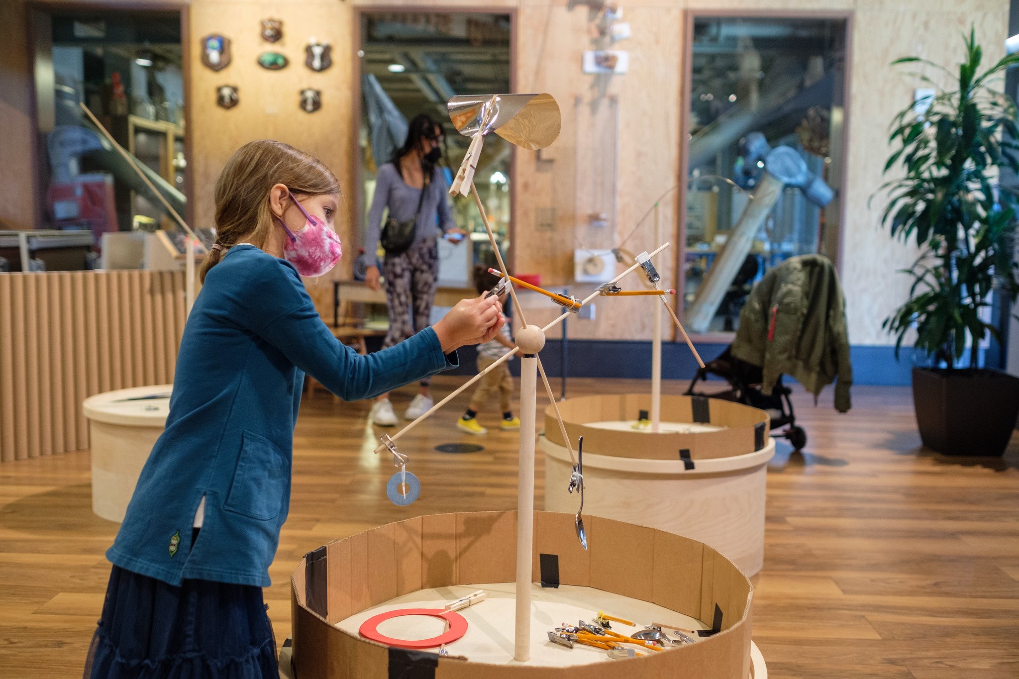
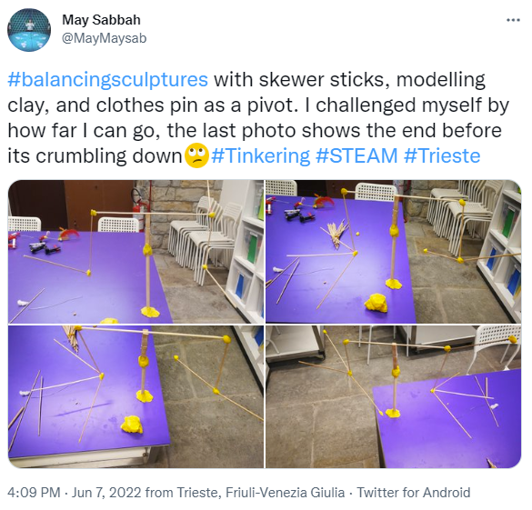
In the kinetic sculptures activity, participants build a construction that balances on a single point. Through the process of attaching and sliding elements with clips from a central hub, participants engage with topics like center of mass, weight, angles, torque and equilibrium. As learners create with everyday materials and aesthetic objects they turn discrete parts into a moving art piece that can respond to the environment.
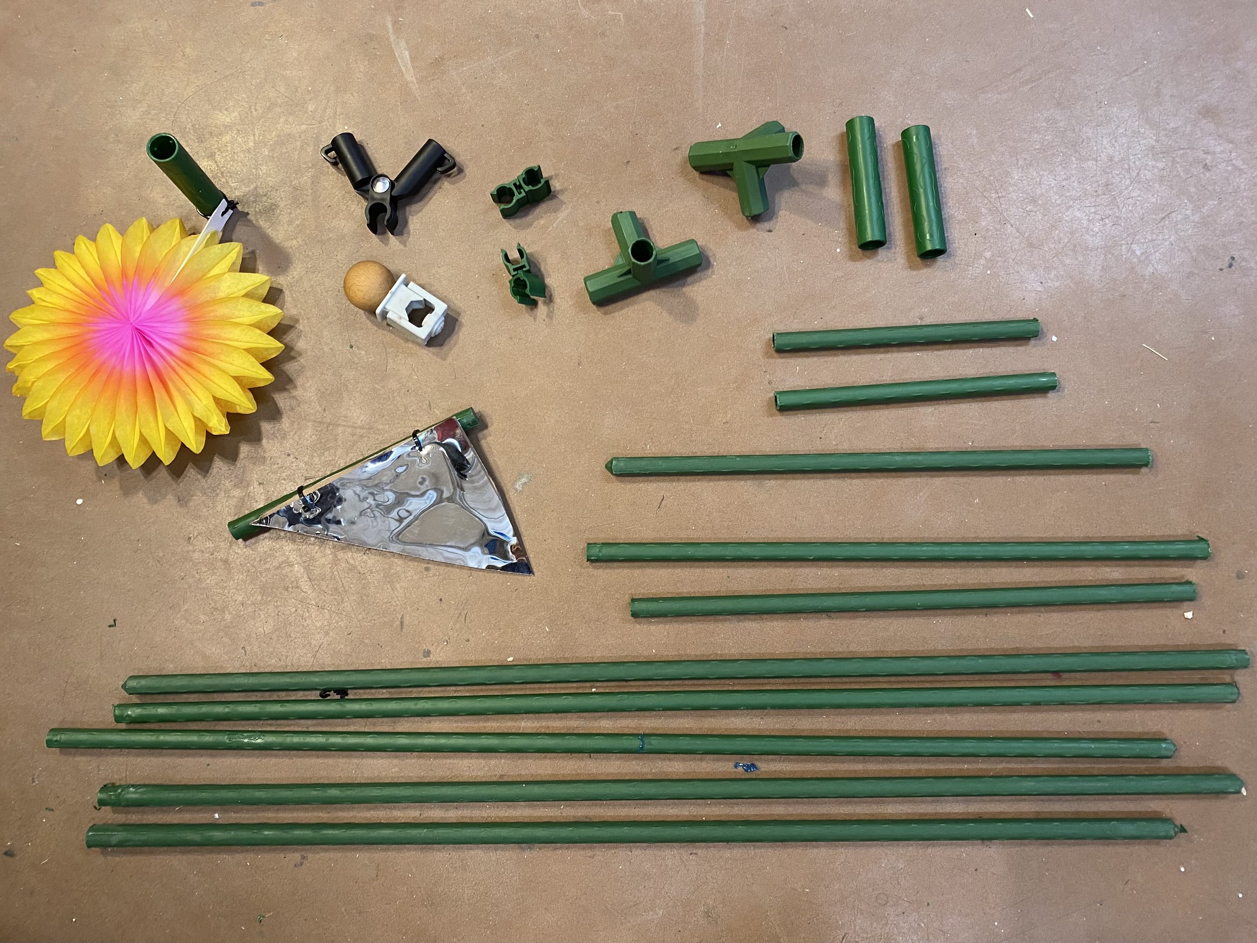
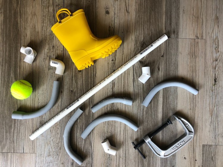
One thing that we spent a lot of time tweaking for this project was a system of sticks and clips that are easy to use and flexible in terms of outcomes. We tried PVC pipes, tomato stakes and wooden dowels before settling on square dowels or pencils. We found that the fact that these pieces have angles and edges give participants the ability to arrange their sculptures freely to extend in different dimensions.
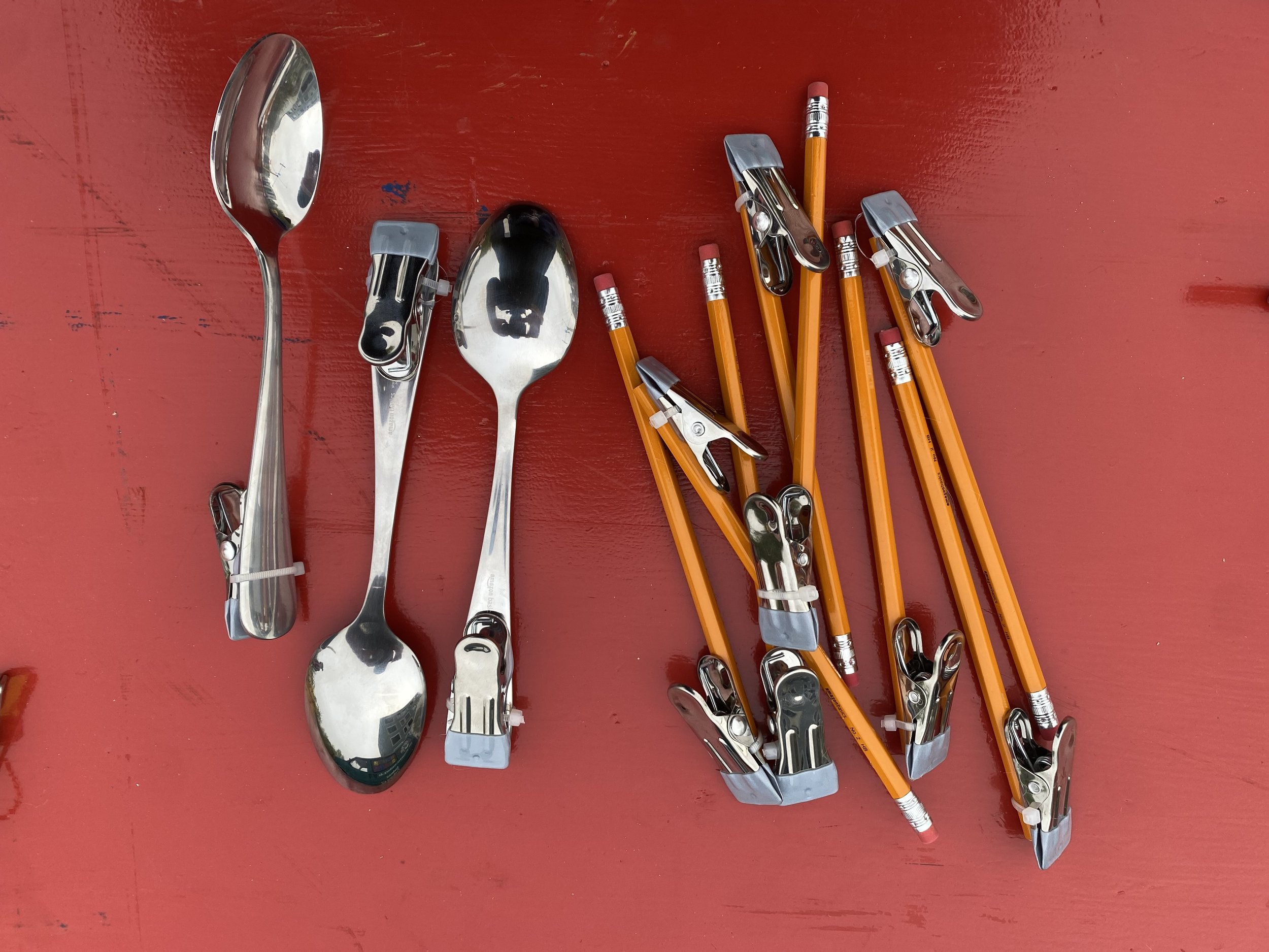
As well, we tested out many different types of clips to try to find one that was familiar looking, easy to open, but also strong when placed in different orientations. A metal clip with a plastic covering on the opening met all of our criteria. The combination of these two parts help us to find an experience where construction is not too easy (when everything automatically works) but the process is not too hard with parts that don’t work intuitively. This set of materials gives opportunities for people to scale the challenges up and down based on their interest and experience.
These decisions support the ability for learners to take risks and have their challenging moments validated. Other elements that support “risk-taking” include lightweight materials that don’t come apart disastrously and a landing pad zone on the stands that show that sculptures falling is natural part of the process.
Another big design consideration was thinking about what kind of starting point hubs to give participants at the beginning of their interaction. Since ‘uftes’ don’t have a facilitator introducing or monitoring the activity, the physical starting points make a huge difference. We tried various hub models including one that was almost fully assembled (where all you did was bend or slide existing parts) to other prototypes where learners had more of a blank slate and started from scratch.
We ended up building the hubs out of colorful balls that look visually distinct from the rest of the parts with little irregular pegs coming out a different angles. These parts on top of sturdy wooden circular bases allow learners to take ownership over the experience from the initial steps to the completed sculpture. The hubs can’t balance on their own, so learners have to work to create something satisfying.
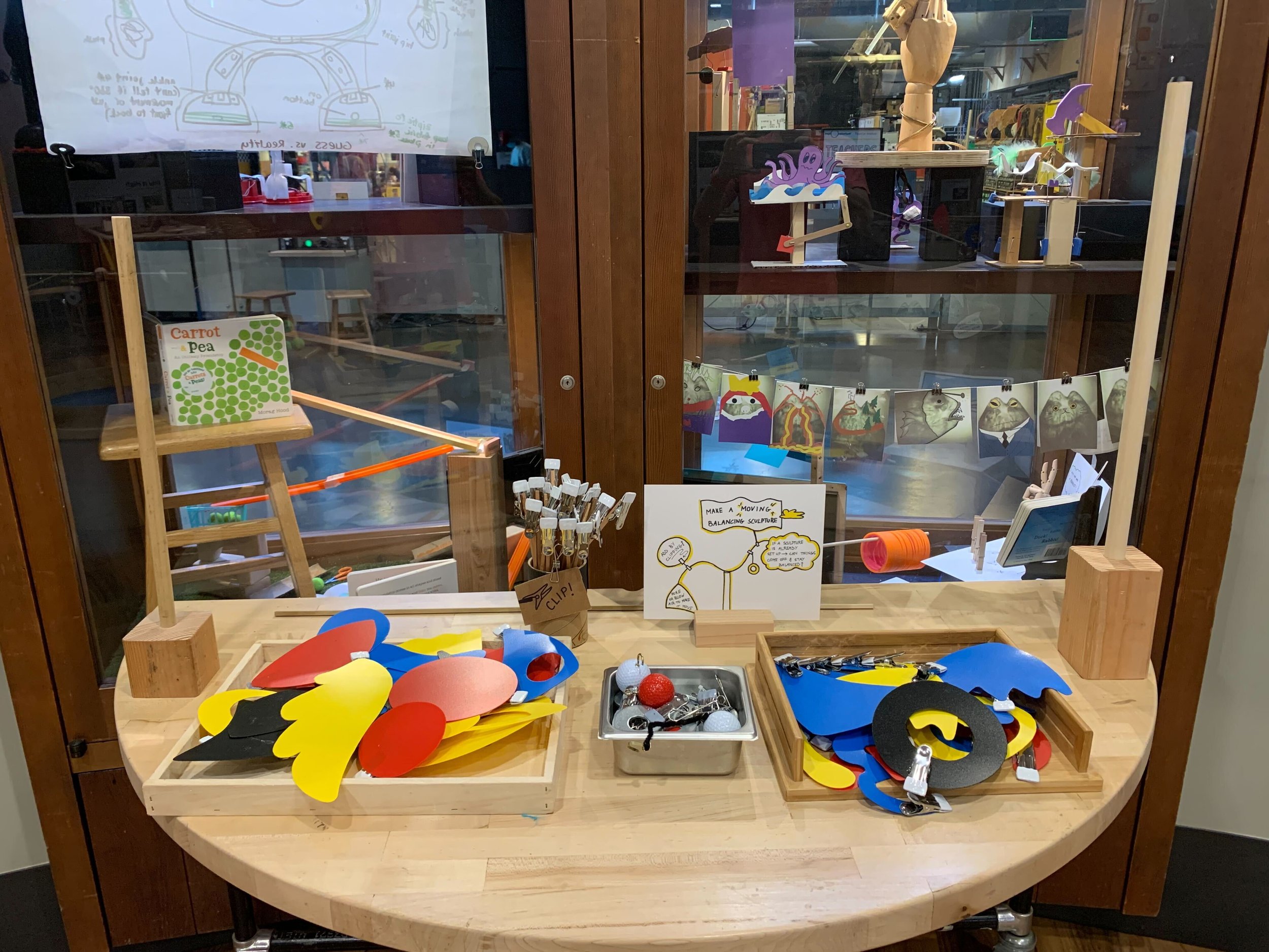
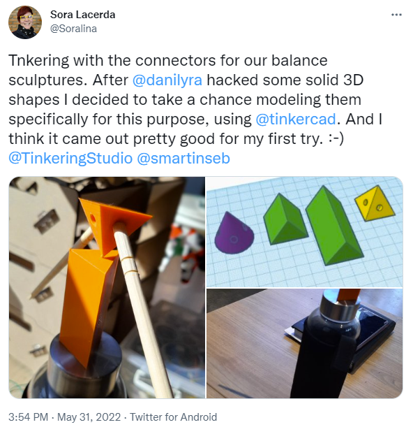
For kinetic sculptures, it’s also important to have elements that are visually appealing and give learners a reason to participate. We ended up with two possibilities for the ‘decorative elements’. The first is based on everyday materials and the parts became modified pencils, spoons and tennis balls. These elements can be whimsical and allow learners to imagine making balancing sculptures with things that they find at home. Another possibility is colorful geometric shapes that evoke the work of Alexander Calder. These give participants the chance to make aesthetic choices that impact the final design. We think that when you explore a phenomenon through an artistic lens it makes it more likely that you will be engaged with science/engineering topics because they are discovered in service of following your own ideas. This drive for making an aesthetically appealing sculpture also expanded our sense of the starting point hubs and in the last weeks we’re experimenting with geometric balance points and curvy hubs.
And finally, we’ve spent a lot of time thinking about signs and examples. When you are actively working and moving around an tinkering environment with others it’s important to have different types of inspiration around the space. While you need to find out how to use the pieces immediately, examples of sculptures which demonstrate wide walls can be discovered (or disregarded) as you spend more time in the space building. We ended up making hand drawn signs that evoked a friendly style and a handmade quality as well as visually appealing moving examples for video screens.
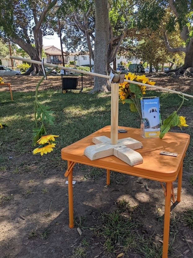
We’ve already seen some great examples of other museums, schools and institutions making their own versions of balancing sculptures which has helped us to reflect about what makes sense to experiment with and what we should keep about this experience. There are new iterations of themes and decorations that fit different environments or events. Dani Lyra and Sora Lacerda from Sao Paolo shared Star Wars themed balancing sculptures for a May the 4th event and the team in MOXI in Southern California made an outdoor sculpture set with sunflowers. We think that there could be many themes that involve participants. That being said, some of the things that we think are necessary to keep about the experience include having parts that support a wide variety of outcomes, multiple stations where people can get inspired from one another and a focus on the aesthetics in addition to the scientific phenomenon.
Shadow Remix
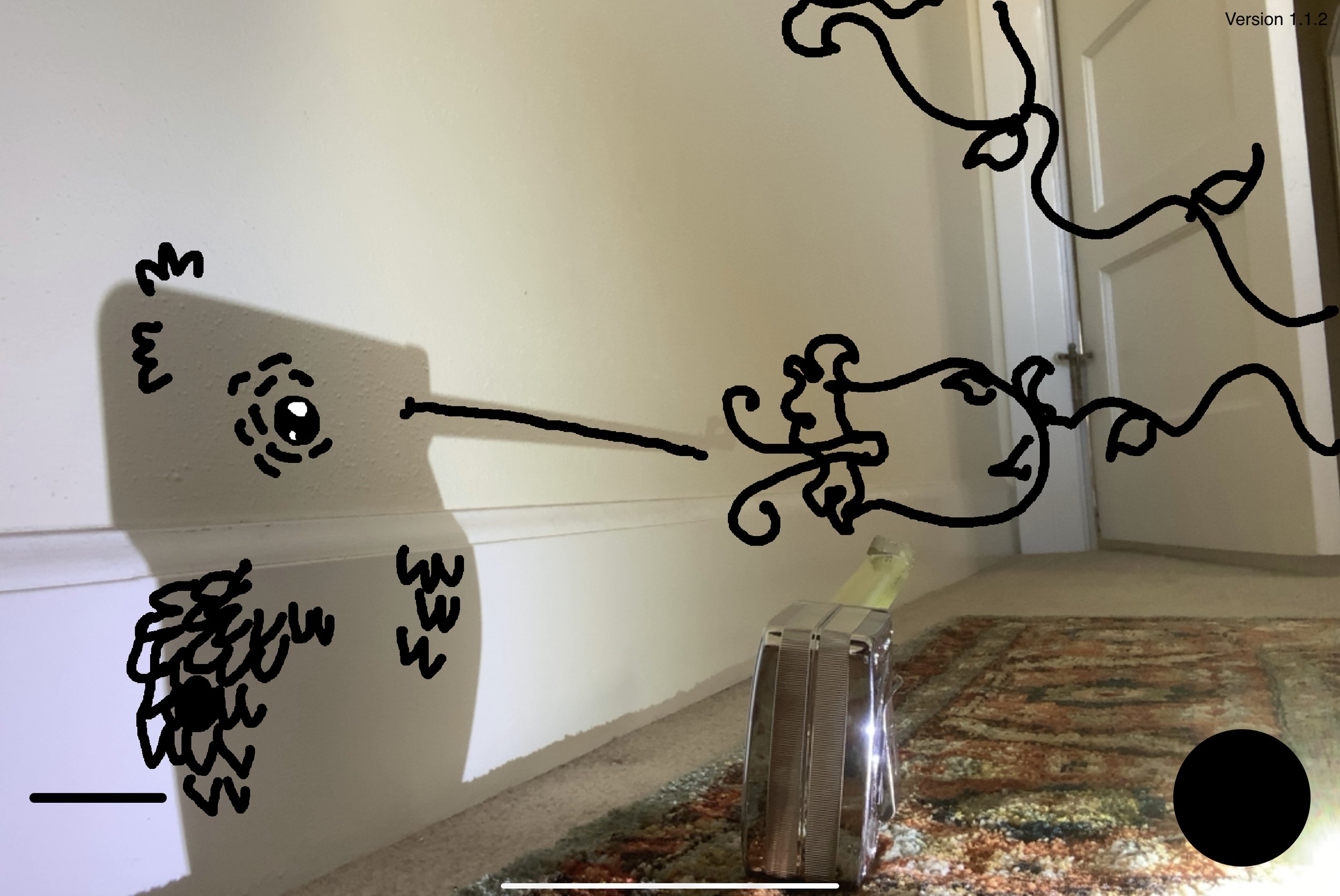
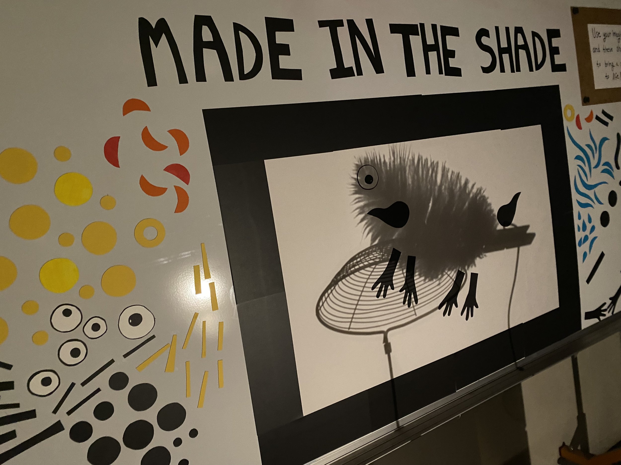
For the second ‘ufte’ development project, we took inspiration from the popular “tinkering at home” activity that the TS team created during the pandemic. In this experience, people find interesting shadow arrangements in the world around them. They they take photos and share them so that other people can ‘remix’ those shadows by adding digital or physical drawings based on their imagination. When multiple people submitted their interpretations of the same shadows, we noticed how everyone had their own unique interpretations from a single starting point. In the museum experience, we got the help of software developer Amanda Ghassaei to design an interactive station where people could discover interesting shadows and create their own ‘remixes’ to add to a shared gallery.
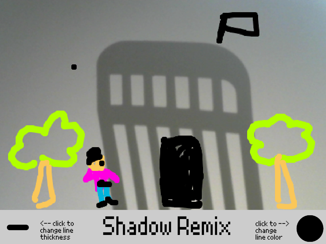
One thing that way really powerful about the design process was that we used digital tools like Scratch as a prototyping technique to make quick and dirty versions of a potential app. We started with Steph who made this sketch as a proof of concept. Creating new versions of Scratch programs allowed us to prototype remotely and all build on or make changes to the software together. Along with drawings and notes, the scratch programs also worked well as a tool to communicate with Amanda when she started creating the final version of the software.
We envisioned the shadow remix ufte as a tabletop experience controlled by the software running on a mac mini. We built a control panel with physical buttons to save the image, delete the last stroke and clear the screen. In the first part of the experience, visitors use two switches to move the materials to find the shadow arrangement that feels most interesting to them. Then learners use a touchscreen with a image of the shadow to draw on top of the shadows and create a unique interpretation of the scene.
We spent a lot of time thinking about the right materials for the shadow remix station and how someone could interact with these materials to find an interesting shadow. For the objects, we looked for things that felt familiar but had lots of different potential shapes or interpretations. Some of the most generative elements were scissors, clamps, numbers, hardware and kitchen tools. In this (as well as in other ‘uftes') we spent a lot of time thinking about the balance between freedom and constraints. For this ‘ufte’ we had to think about both the ways that people create the shadow arrangement and the way that they remix the scene. For the shadow creation, a breakthrough was having two objects on two slow moving motors which gave learners a limited but open-ended experience of creating a shadow composition. Although it was less free than letting participants engaged in a process of ‘problem posing’ or creating the canvas for the remix which we is an important tinkering skill.
For the remixing illustration part of the activity there were also many choices that we made along the way. One really interesting idea that Steph worked on was using a magnet board and precut shapes to physically add to a shadow sculpture. We did some user-testing with this type of station and people were engaged in the process. In the end though, we decided that drawing on the touch screen felt more open-ended. The ability to choose color and line thickness allows people to experiment with bringing their ideas to life.
In the ufte, we hope to create the similar feel of collaborating, designing a shadow remix, having others reinterpret your creation and sharing it widely that happens during the online project. Some ways that we did that included having multiple stations and room around each station for groups of people to work together. As well, when someone finishes their shadow remix they can save the drawing to a gallery on a large monitor in the space and see their remix among many other creations.
In the next versions we’re planning to track the position of the motor and create the ability to incorporate metadata in the gallery so there can be examples, videos and galleries that illustrate the process of re-imagining and remixing. This allows educators to also be observers and curators of creations made by participants and puts the creativity of the learners at the center of the experience.
Another thing that we’d like to continue to experiment with is the combination or alternation between physically and digitally remixing the shadows. We’d like to revisit with Steph’s idea of magnet parts to find a set of shapes that approaches the personally meaningful aspect of drawing with a finger on the touch screen. As well Keith Braafladt, showed the possibility to make more unique effects with shadow sculptures and it could be interesting to experiment with filters, mirrors lenses or other ways to change the quality of the shadow. We are also planning to release the online version of the app with our instructable which hopefully will allow educators to explore a wide variety of set-ups and workshops.
In the next post I’ll share about Rhythm Blocks and Unusual Rollers as well as some final thoughts about this first phase of the ‘ufte’ development process.
The LEGO Playful Learning Museum Network initiative is made possible through generous support from the LEGO Group.
